Better Retextures : Detailed Guide For NifSkope and the GIMP
| Tools used in this tutorial
Required
|
Introduction[edit | edit source]
This is a very detailed reference tutorial. It's mostly aimed at making things easier for the absolute beginner who wants to learn GIMP and texturing for Oblivion. Hopefully, this will allow you to use GIMP and NifSkope to make better retextures with more color variety, higher contrast, and unique additional images.
Important Preliminaries: The Modding Toolbox[edit | edit source]
1. You'll need a BSA unpacker in order to get at the default game meshes and textures. Get one here
2. You'll need the GIMP, a powerful image editing program. You can use Photoshop, but GIMP is free and I will be discussing commands and features of that particular program. I'm currently on version 2.4. Get GIMP and the GTK runtime environment (you need it to run GIMP) here.
3. You'll need a .dds plugin for GIMP to be able to open the game's texture format. Get it here.
4. You'll need a normal map plugin for GIMP to be able to generate normal maps. Get it here.
5. You'll need NifSkope in order to retexture game meshes. This wonderful mesh viewing and editing tool will also allow you to see your texture change with each save as you go along. Get it here.
Important Reminder about GIMP[edit | edit source]
GIMP has a wonderful feature that some other programs do not have. You can use the "undo" command (ctrl-z or click edit-undo) even AFTER you've saved a file. The undo history only disappears after a file has been closed and reopened. This means you can try things out, look at them in NifSkope, and then cheerfully undo 25 steps in a row.
There is a limit to GIMP's undo levels, which depends partly on a preference setting and partly on how much memory and swap disk you have available. The preference setting asks GIMP to use whatever memory is needed to guarantee at least that many undo levels, but GIMP may let you have more levels if the files are small or if your changes affect only a few pixels. Setting the number too high can cause GIMP to use up a lot of disk space (temporarily) for tile swapping, but it cleans up after itself when you exit the program. Check this setting before using the above technique, so that you will know how many undo levels are reliably available.
Choosing the Mesh to Retexture[edit | edit source]
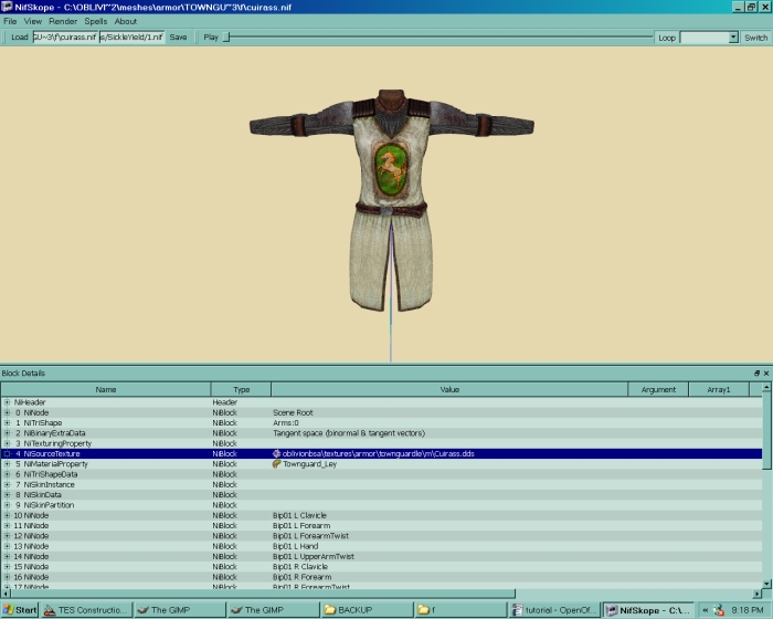
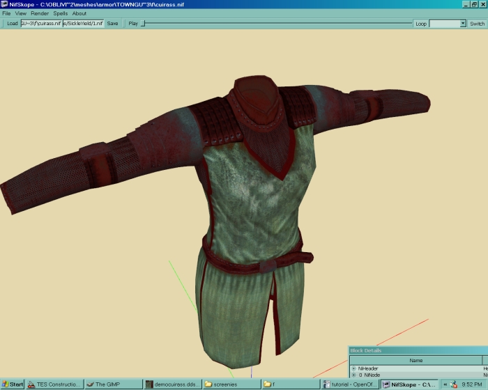
I'm going to use the Leyawiin cuirass for an example. In this case, I open the folder with all my unpacked BSAs in it and open the folder called "meshes," then "armor," then something like "leguardcuirass." Then I should see two folders that say "m" and "f." I'll start with the cuirass under 'f', but since the same texture goes on both it doesn't really matter. Double-clicking the mesh opens it in NifSkope.
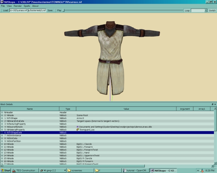
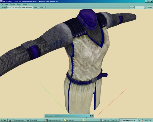
You might see the mesh looking all white, even though the "nisourcetexture" node in NifSkope has a texture there. This is because the texture is in a different folder than NifSkope expects. Rename it to the correct one (BSAS/textures/armor/leyawiincuirass.dds or whatever) and the texture should appear. It looks a little flat now, but that's because NifSkope doesn't show the normal map exactly the way the game engine does:
Leave that window up on the screen, but don't save yet.
Opening the Texture with GIMP[edit | edit source]
Now click through the bsas folder until you find textures/armor/ and the Leyawiin cuirass.
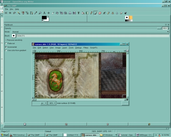
Now we're looking at the texture. You might get an error message complaining that the image is a volume map, but just click "OK" and ignore it.
You will want to open a layers dialogue, so choose dialogues - layers, channels and paths. Click on the "layers" tab of this dialogue when it pops up. It shows you a tiny image of your layer. This will be very useful as we add more layers.
The texture looks nothing like the mesh. There's a good reason for this, and it has to do with UV maps, which are a longer subject for another tutorial. Different parts of this texture are being placed on different parts of the mesh, and there's no connection between where they are in the texture and where they will be on the final project. Some bits of the flat texture will even be reused on more than one part of the mesh. That's why it's good to look at our project in NifSkope as we go, so we can see what we're doing.
Saving A New Texture and Mesh[edit | edit source]
Use File-Save As to make a copy of the texture with a new name, say MyCuirass.dds in the folder data\textures\armor\YourName. Be sure and type the extension or GIMP won't save it. I find saving at DXT3 compression with "generate mipmaps" checked works best. If you do not compress, your file will be larger, and if you don't generate mipmaps, the file will look odd at a distance or for those without texture size set to maximum.
You may want to save as an .xcf first in case we need to use different layer modes. Then when you're ready to make a .dds, you would use layer - merge visible layers and save as above to export as a .dds file.
For more info on the .dds file format and what mipmaps mean, look here.
Now go back to your NifSkope window and change the texture path there to where your texture is instead of the game one. It should look exactly the same in the window. When that's done, save the mesh as something new too, such as data\textures\armor\YourName\mycuirass.nif.
This is important, because if you overwrite up the original unpacked .nif and .dds you'll have to re-extract them from the .bsa file.
Removing an Emblem: Rectangular Select, Cut, and Paste[edit | edit source]
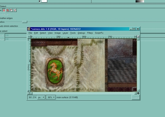
Now back to our texture. I chose this one for a good reason - most of its parts are rectangular, so we can easily select them. Right now I'm going to use the Rectangular Select tool (press r, click and drag) to select the horse emblem on the cuirass front.
We're going to be using Rectangular Select quite a lot.
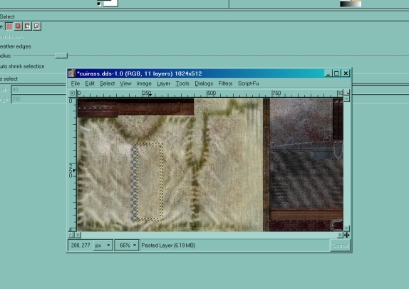
Now I use edit-cut to make the selection disappear. There's a hole in the texture now, with a grid showing behind it. That's no problem, because we'll fill it back in. Use the rectangular select again to choose a longer, narrower area on the left side of the hole, then alt-edit-c and alt-edit-p to copy and paste it. Now you can press "m" to move this selection over to cover up part of the hole. When it's where you want it, go to Layer-Anchor Layer to anchor it in place. Repeat with the right side, and if necessary top and bottom, to fill in the hole completely.
You don't have to cut things off before you paint over them, but it makes it easier to tell where the edges of the gap will be.
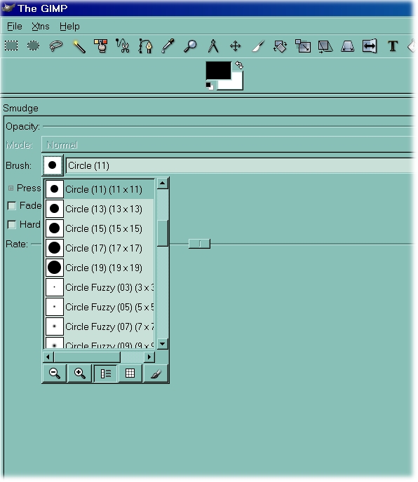
If you want to make this area look more continuous, take a look at the "wrinkles" painted on either side of the new blank space. If you copy them, then drag them down and diagonally, you can make it appear that they continue right down into the selection. This helps to make it 'fit in' and not scream 'Something else was here!' You can also use the smudge command (s key) to blend the edges, but do it sparingly or you'll have a very blurry texture. Remember, any tool you use can be resized in the main gray GIMP area. Click on the little round circle or the little black square, depending what tool you're using, and a drop-down menu will appear with all the possible brushes.
Another copy-and-paste blending technique in GIMP is to use the "feather edges" setting in the selection tool (rectangle, circle, freeform, etc.). This causes the copied pixels to be less opaque near the edges of the selection, but note that this also makes the selection process less precise, so stay away from anything you don't want in the copied pixel set. Alternatively, you can go ahead and select a sharp-edged area, but then feather its edges after and positioning pasting the copy but before "anchoring" the floating layer back into the main image. To do this, just use a free-form selection tool with the "feather edges" feature enabled to select some pixels near the edges of your floating layer, which will make the rest of the layer temporarily invisible. Then press the Delete key to erase them to transparent, then press Shift-Control-A to redisplay the rest of your. The selection can be amended in multiple ways before the Delete, so load up a test image and experiment.
If you are blending on an image that is non-repetitive (such as the random wrinkles in the tabard fabric), your replicated pixels may look more natural if you do the copies from several smaller areas, rather than copying a large section all at once.
When this part looks satisfactory to you, save the .dds. Now go back to NifSkope and look at it. Voila, you can see your new cuirass with no horse on the front. If you want to, you can easily cut and paste an emblem of your own design onto the cuirass, and you won't have to worry about it being the same shape as the one you cut off.
Isolating Parts of a Texture: Paste as New and Colorize[edit | edit source]
Now, in order to make different parts of our texture look different, we could just use the rectangular select and color tools, but this method will give us a little more control.
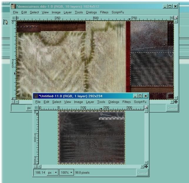
Let's start with a nice bit of detail. There's a long, narrow piece running down the center of the Leyawiin cuirass. Rectangular select it and copy it. It might take a couple of tries to get that shape and that shape only. Feel free to zoom in and out using the "View - zoom" menus or the numpad + and - . I use "View-shrink wrap" a lot, too.
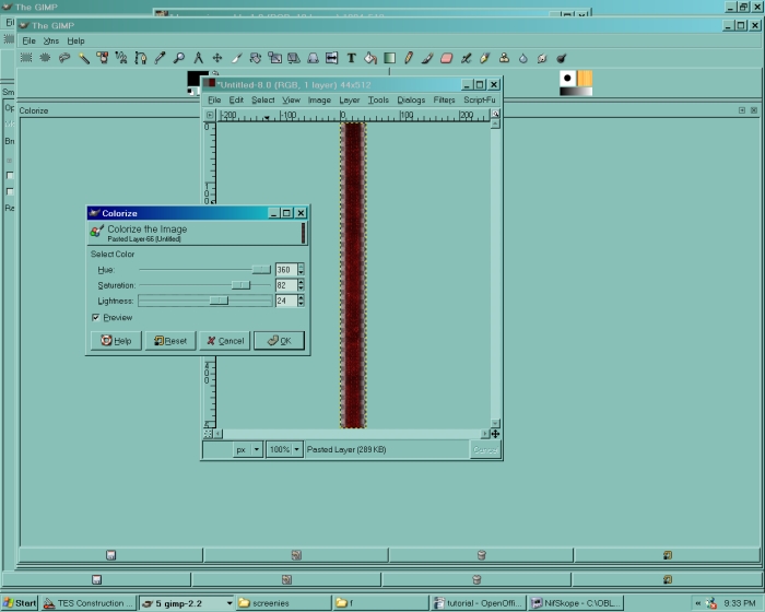
Now go to Edit - paste as new. The rectangular piece is now in its very own file that we can edit all by itself. On this new file, go to Tools-Color Tools-Colorize. Now you have three sliders, and the rectangle seems to have gone black. The sliders in front of you say something like color, saturation, and lightness. "Color" tells you what color the selection will turn, "saturation" is how intense the color is, and "lightness" is just what it sounds like. Play with the sliders until you get a color that interests you.
Other color tools will allow us to make a selection more than one color or change it in more than one way, but we'll do the simplest way first. If you want to make your color even more vivid, or perhaps a little subtler, you can also use Tools-Color Tools-brightness and contrast. This one also has only two sliders and is very easy to use.
Once the new selection is a new color - I'll make mine a nice bright red - go to Select-Select All and then Edit-Copy.
Now go back to your original texture and click Edit-Paste. The rectangle is back in your texture. Drag it back over to where you copied it from and paste it over the original bland one. Now anchor it and save the file.
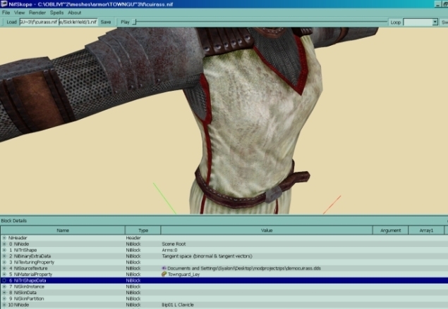
Look at NifSkope again. That insignificant little strip actually covers several different parts of the cuirass, giving us a nice red lining peeking out here and there. This is why we need NifSkope - we can see exactly what our changes actually do on the mesh itself when looking at the UV map might not be enlightening.
Helpful Note: Parts of the Texture and What to Do With Them[edit | edit source]
You now have two files open, mycuirass.dds and the unnamed file with the pasted red rectangle in it. If you don't think you'll want it again, you can just exit the pasted one without saving it, and it will disappear forever. If you think you might need to make several different retexes of this cuirass in future, it's not a bad idea to save it as something different, such as cuirassdetail1.dds. Do this when you know you will need several versions of something for a project.
Now let's look at our main texture again. Notice how it's almost all divided into neat squares and rectangles? This means the world is your oyster, because you can recolor any of these parts separately from the others. You can recolor just the cuirass fabric, and then paste a new emblem onto it. You can give it black metal parts or a shiny belt. Anything you like. This is the answer to all those bad retexes with bizarrely-colored metal on them - cut the metal parts off and tweak them separately.
You can also use layer - duplicate layer to copy the main layer, then erase parts of the duplicated layer until only the one you want is left. This is a very powerful method if you're saving a version as .xcf; nearly all serious GIMP texturers will use it.
For those parts that aren't strictly rectangular, here's another method.
Isolating Parts of a Texture: Layering, Erase, Color Select, and the Fuzzy Select[edit | edit source]
If you need to copy a texture part that isn't quite rectangular, go ahead and select it in a large enough rectangle to contain all of it. This will mean it includes part of the rest of the texture, but that's all right, we'll fix it. Copy and paste as new again. Now press shift-e to bring up the eraser brush. Make sure it's a size you can use comfortably for the small section you need to erase. Now use it to erase the part of the texture you don't want. You can erase in a straight line by pressing down the left mouse button, then holding down shift and dragging the mouse. A line should trail out behind it. Click again when you're ready to create the line of erasure.
You can also use this with parts of a texture that aren't remotely rectangular at all. It takes longer, but it's sometimes worth it to get exactly the color effect you want.
If you want to select parts of a mesh that are mostly one color, like the yellow-gold parts of the archmage's robe, you can also use Select-Select by Color and click on that color. Then click Select-Invert to select everything BUT that color, then Edit-cut. Now everything but the yellow you selected is gone. This is also tricky, because any given texture contains many subtle color shades that may seem similar to you but very different to GIMP. In this case, remember that you can select more than one color by holding down shift and clicking away with the color selector. This feature alone has made retexing much easier for me, and I hope it does for you, too.
And now it's time for...
The Magical Fuzzy Selection Trick[edit | edit source]
You can use the Tools-Selection Tools-Fuzzy Select (or press z key) to copy and remove parts of a texture that are oddly shaped, but this takes a little practice. Remember that if you're using fuzzy select, you can hold down the shift key and keep clicking and dragging to select a bigger area.
You can also use fuzzy select in another way in order to create very precise selections with absolutely ANY kind of outline. Here I'll use the example of the lips on the Bethesda facial texture. We'll try giving the plain old Bethesda face red lipstick. That will give it to both sexes, since there aren't separate facial textures for men and women, but never mind, we're not using it in a mod at the moment.
I first open the textures\characters\imperial\humanhead.dds file. This has me looking at a compressed-looking version of a human face. Save it as something like textures\characters\MyRace\myface.dds. Bring up the NifSkope window with meshes\characters\imperial\humanhead.nif. It already has the default texture assigned to it. Change the texture path to the path of your texture. You now have something that looks like the original Imperial face on the mesh.
Back to the face in GIMP. Go to Dialogues-Layers, Channels and Paths if you haven't already, and a little square will pop up showing the layers of your image. Right now there's probably only one. (If there are several, do Image-Flatten Image to get rid of the mipmaps.) Click the button in the dialogue that looks like a piece of paper to create a new layer, and choose "transparency" when that option comes up. This layers dialogue is very much our friend.
Make sure and click on your new empty layer in the dialogue to make it the selected one. The selected layer has a dark bar over it. This is very important, because otherwise it's possible to have two layers visible at once and no idea which one you're working on.
Make sure your new layer is below the other one. There are two little arrows at the bottom of the layers dialogue that let you move a selected layer up or down. Each layer also has a little eye symbol next to it that appears or disappears when you click on it. This tells you whether or not the layer is visible. Make sure both layers are visible, but the NEW one is selected.
The picture doesn't look any different. This is good. It shouldn't yet. Look at the outline of the lips. They are not square, round, or any other shape that would easily lend itself to selection tools. Choose a paintbrush and paint over the lips with plain black. We're painting in the new layer, remember, so you're not defacing the original texture. Use whatever size brush you're most comfortable with. Just make sure the whole outline of the lips is covered. This may take a couple of tries because of their odd shape.
Once you have your flat black lips, pull up the Layers dialogue again. Now make the main layer with the face in it INVISIBLE, so that only the new layer can be seen. It should have a blank grid in the background with a solid black lips shape on it. If it doesn't, you probably painted on the wrong layer and now have a long of Ctrl-z-ing to do.
Press z key. Right-click on your lip shape until the whole thing is selected. (You can also use Select - Select By Color for this.) There should be a moving dotted line around it. Click Select-invert and leave that there. Now go back to the Layers dialogue. Make the lippy layer invisible and the original face visible. Look at the texture again. The black shape is gone, but you now have a perfect dotted line outlining your lip section. Click Tools-Color Tools-Colorize. You should now be able to make this lip shape as vividly red as you please.
When the lips are the color you want, do Select-None, then go back to that layers dialogue and delete the black shape layer. The delete symbol on the layers dialogue is on the far right and looks something like a mushroom cloud.
Save your new file. Look at it in NifSkope. You now have Imperials with lipstick.
If you think about it, you can discover many other uses for this sort of tool. Working with the layers takes a little practice, but it works much better than the select-copy-erase method I originally recommended when you're working with oddly-shaped areas.
More Advanced Color Tools: Hue/Saturation/Value and Color Curves[edit | edit source]
Here's where we get a little fancier.
Hue/Saturation/Value[edit | edit source]
Use this sparingly, because often you can get results just as well with color select and brightness/contrast, but there are times when it's quite a powerful tool. You can use this to make changes to the entire picture, or use color select to make changes to just one color.
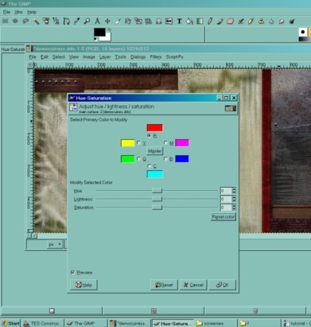
Let's start with the whole picture. Suppose we're looking at the Leyawiin cuirass again, and we'd like the parts we made bright red to be blue instead. Click on Tools-color tools-hue/saturation.
Now you're looking at a puzzling wheel of colors and three sliders under it. The wheel lets you choose a color to edit in the picture, based on what color value GIMP thinks each pixel has. Right now the wheel is set to "master," which means changes you make apply to ALL the colors in the picture. If we want to affect just red - the color I made the details earlier - click on the red color box, and the circle under it will be filled in.
There's a tiny checkbox in one corner of the dialogue that says "live preview." Make sure it is checked, so you can see what effect your changes will have before you make them "real."
With red selected, try dragging the sliders back and forth. "Value" makes the color lighter or darker, while "Saturation" makes it more or less intense. Turning the saturation to 0 will make all the red look gray, because it won't have any color any more, but it will still have a light/dark value. "Hue" is mostly what we want right now. Drag the slider until the red in the box looks nice and blue. If you have the preview checked, you can see the results on your cuirass.
You can also see why we have to use this tool carefully. Every single red pixel in the picture is affected, not just one shade. This can result in strange spots or effects that we don't want. Sometimes you can avoid this by using color select to select a specific shade and then using HSV on just that shade.
This also gives us another possible way to change around the entire picture's color scheme. You can click back to master and desaturate the entire picture down to 0, then use the selection tools (as in the above sections of the tutorial) to recolor it one section at a time. This isn't always necessary, but it can help when you've got an overly complex color scheme that doesn't easily lend itself to tweaking with sliders.
Remember, if you want to change everything BUT a particular color, you can click edit-select by color, choose that one color, and then click select-invert. Then do whatever you like. Play around with these things and you may be amazed what you can do.
Color Curves[edit | edit source]
This is tricky and will not be useful all of the time.
HSV has a shortcoming, which is that it tends to recolor every shade of a given color. Color Curves lets us change shade by shade, but it's a subtle tool and it takes practice to make it work well.
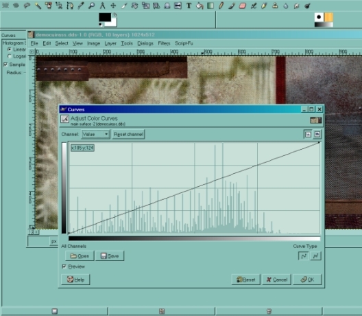
To work on the entire picture, go to Tools-color tools-curves.
An exponential graph came up. Click on the little box that says "value" and you'll see you have several choices, including the colors and alpha. Just for an example, click on Red.
The curve looks the same, but when you click on it, little points appear. You can drag one particular point up and down to alter one particular shade of red, although the fewer points you have, the more shades are affected. When you drag upward or downward, the color becomes more or less intense, and dragging sideways (which is only slightly possible) tends to alter the shade. Try it and see what happens to your picture. Make sure you have "preview" enabled again.
With a light touch, this allows you to tweak around all the colors in your texture separately. The "value" graph affects how light or dark the colors are, and different parts of it deal with different hues. Dragging the "alpha" may not appear to make much of a change in your picture, but it will make it more or less shiny when you're looking at it ingame, so be careful with this.
Again, this is one I use sparingly, but it can provide some complex and subtle effects if you know how to use it.
It also has another benefit: you can save each individual curve. This is useful if you're making the same changes to several different textures, say retexturing a whole suit of armor. Click on "save" and give your curve a useful name, like "leyawiinretexalpha," so that you can tell later where it belongs. Now if you click on "open" from this curves dialogue, it will bring up your saved curves and let you apply them directly to your texture. This can save a lot of time. Just remember that if you have separate curves for red, green, blue, AND value AND alpha, you have to save five curves. It won't save the entire curves dialogue for you.
Normal Maps[edit | edit source]
Why do I Need a Normal Map?[edit | edit source]
Oblivion is different from Morrowind in that every texture needs to have a normal map. Otherwise your mesh may look black or pink ingame. The normal map can basically be any copied .dds that is renamed to the texture name plus _n, as in mycuirass.dds and mycuirass_n.dds, but that's not the best way to do it.
With a flat normal map, your texture will look flat. With a lumpy normal map, your texture will look lumpy. With a translucent normal map, your texture will be duller; with a more solid-looking map, it will have more reflectiveness and shine.
How Do I get One?[edit | edit source]
The easiest way to do this in GIMP is using the GIMP normal map plugin (remember that download link up above?) so make sure you have it installed. Then open your original texture. If the plugin is installed correctly, you should be able to go to filters - map and see a list that includes the word "normalmap." Click on it, and you get yet another dialogue with sliders.
Again, make sure the preview is enabled. With the default settings, you should see some sort of purplish thing in the window (it won't show a preview of the whole file with this one). This is because the normal map doesn't affect the color of the texture, but it tells Oblivion how much the texture should stand out or sink in over the mesh.
Here are some useful techniques.
The Lumpy/Worn Look[edit | edit source]
To get a look wherein you can see every scratch on a sword and every dent in the armor, try using Sobel 3x3 and setting the scale higher than 1. (Increasing the scale makes the texture's highs and lows more pronounced.) Look at the preview until you get something that looks like you want it. You can use Sobel 5x5 for something really extreme, but I've seldom found that necessary.
Carved Runes or Bas Relief[edit | edit source]
If part of a normal map seems to be popping out when you want it to look carved in (or vice versa, for that matter), try checking "invert x" and "invert y" before you hit the "okay" button. This will affect the whole normal map, so you want to be careful in your use of it. Remember, you can cut and paste parts of a normal map just as you can with a texture, so if necessary you can cut off the runes, normal map them separately, and paste them back on. You can also use layering.
Smooth and Shiny[edit | edit source]
Go down to the dropdown that normally says "alpha = unchanged" and change it to "alpha channel = height." Most of your normal map will seem to disappear, with only the highlights standing out. You can get a little more depth by increasing scale, but you'll most often use this one on things that need to be shiny or translucent more than they need to stand out. Some fabrics, gems, and the occasional sword blade or ultrasmooth armor use this setting.
Don't make the mistake of setting "height source" to "alpha" in the dropdown that's just above the "alpha=unchanged" one, as that seems to make everything flatten out. (I'm still not sure why.)
A Note on Height Vs. Shine And Specular Maps[edit | edit source]
How deep your normal map is affects its depth in the game. This is why you can use Sobel 3x3 to get a deep normal map. A key bit of information you should also know, however, is that how opaque your map is affects how shiny it is.
Here is a wooden texture made with a GIMP pattern preset:
And here is a Sobel 3x3 normal map made from it:
As you can see, this version is completely opaque; it would be very shiny in game.
This means that if you want a map that is not shiny, you should partially erase it. I use the largest brush I have and set the opacity (this is on the main GIMP window when you choose "erase") to from 75 to 90%, depending on whether I want light shine (like velvet) or almost none (like skin).
If your map does not have an alpha channel, you can add one using layer - transparency - add alpha channel.
Here's the wood texture erased 75%:
This way you can create deep normal maps without having everything look like plastic.
For a more sophisticated approach to this, you can create a specular map. To do that, you need to go to the layers dialogue and use layer - add layer mask.
Choose the "transfer layer's alpha channel" option.
Use alt + click on the white mask that appears to the right. Now you will see the mask in the main window. (alt + click again will return to the view of the normal map so you can see your results tinkering with the mask.)
Usually what you see will be totally white, for complete opacity and/or shine; if you used the erasure method above, it will be a shade of gray.
The closer to white something is here, the more opaque it will appear on the normal map and the shinier it will be in game. The closer to black it is, the more transparent it will look on the normal map and the duller it will be in game.
The very simplest spec map is created by selecting your regular texture and using select - all and edit - copy, then pasting into the white mask. This creates a grayscale version of your texture. The normal map will be more transparent (and less shiny) where your texture is darker and less transparent (and more shiny) where your texture is lighter.
Here's what it looks like when I do this with the wood texture.
Usually this will give an overly pale/shiny result, or even an overly dark/opaque result if your texture is very dark. You can use colors - brightness/contrast to correct this by making it brighter or darker, or by making more of a contrast between bright and dark areas.
When you have a result you like, right-click on the mask and choose "apply layer mask" before saving your normal map.
Glow Maps[edit | edit source]
Do I Need a Glow Map?[edit | edit source]
Not every texture will need one, and in some they're a bad idea. In general, glow maps are what you use when you want part of a texture to be bright and glowing but not the entire thing. This is used on the glass parts of the glass armor and weapons, for example, which is what gives them their look of glowing depth. It's also used to make parts of the daedric weapons glow in the dark.
This is also a good way to make things show up even at night or in dark places, or for fiery runes on objects.
How Do I Get One?[edit | edit source]
To use a glow map, you will have to look at a mesh's nimaterialproperty in NifSkope and make sure the emissive color is not set to black. If you set it to white (1.0 in R, G and B), the glow map will be VERY bright; if it remains black, there will be no glow at all. Shades of gray give varying degrees of glow.
You don't need a special plugin to make glow maps, because a glow map is just a black and white picture made from the texture. The very simplest glow map of all is just the original texture that you've completely desaturated (see the Hue/Saturation/Value section) of all color. Then you save it as mycuirass_g.dds and make sure it's in the same folder as the texture and the normal map.
Of course, that won't look very nice ingame. The game engine reads the glow map as "white=glow a lot, black=not at all," so gray areas will be luminous. Notice, if you open the glass cuirass glow map (something like glasscuirass_g.dds in your bsas under textures\armor\glass), you see white swirls on black, with the swirls being where the glass parts of the armor are. This keeps the chain mail or leather parts of the armor from glowing.
What I usually do first is to select the parts of the texture I want to glow. This is easier than it sounds, since it's usually one color or one set of shades that can be chosen using Edit-select by color. Then I do select-invert to select everything BUT that color or area. Now I go to Tools-color tools-brightness/contrast. Turn the contrast all the way up and the brightness all the way down. Now everything non-glowing is black. Select-invert again to go back to your intended glow areas. Now do the same thing, but turn the brightness UP instead of down. This should make your glow areas all white.
Do Select-none, and now "save as." Name the glow map mycuirass_g.dds, or whatever your texture name is with _g on the end. Again, make sure it's in the same folder as the texture.
I've recently found out that you CAN use a colored picture as a glow map. This can be useful if you want something to be one color and glow a different one. Here's a thread on the Niftools forums with some useful information:
NifSkope Reminder[edit | edit source]
NifSkope won't show normal or glow effects, so you can basically only see those in a playtest. Most of the time you will need to set your material's "emissive" setting to completely white (that's 1 in the r, g and b sections of it when you click on it) in order for the glow map to show up in game. This will make your material lighter, so you may have to compensate by darkening the texture.
Conclusion[edit | edit source]
If anyone has other techniques in the GIMP that they feel should be part of this tutorial, please feel free to create another heading and add them.
